Case study ↓
Reap rebrand design system (components)
Design system
The rebrand of Reap started at early 2023, it is the second rebrand since I started working here.
Roles
UX/UI design
Tools
Figma
Storybook
Material UI 3
Client:
Reap
Why are we doing a new design system?
With the rebranding with 6th years anniversary, the brand is changing the primary color from pink-orange gradient to teal and purple.


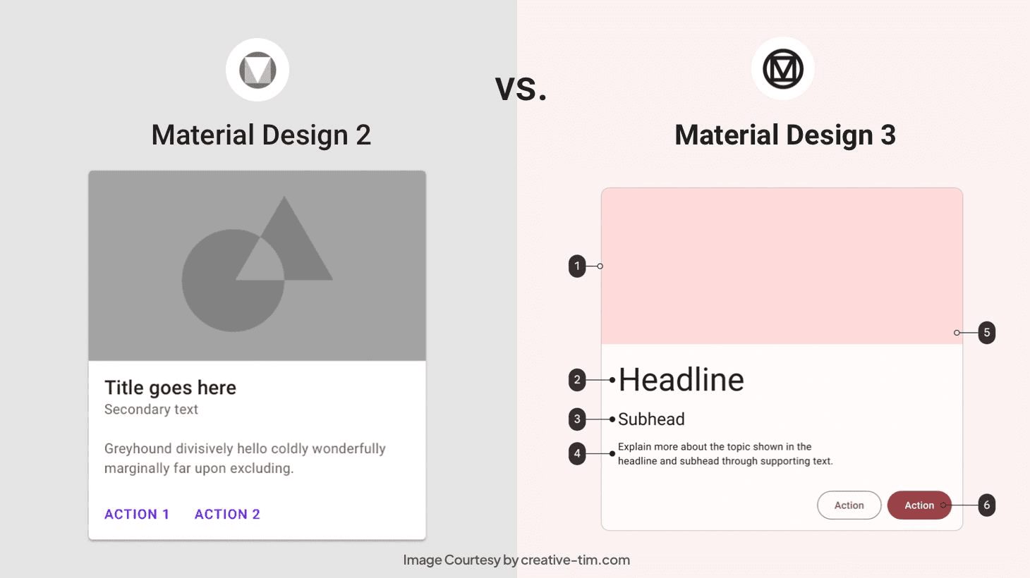
Start with Material design 3 as the foundation …
The old design system was base on Material Design 2, so while to revamp the whole branding, the team decided to upgrade it to Material Design 3.
Remove atom components
One of the pain point with old components library is that there are too many atom components, which make the file mega massive. It created a massive headache to engineers and other designers as well.


Output ↓
Build beautiful products …
Personal
Devices should feel personal. Individual choices for device color and form are brought to life through software. Dynamic color extraction imbues the system with a personal aesthetic, while changes in shape and lighting combine to create a holistic, resonant experience.
Spirited
Enliven everyday interactions. A spirited energy animates routine interactions like the response of a ripple or a FAB state change. Updates to shape and motion lend an active, alive quality to elements that react and adapt to user input and contexts.
Unexpected
Design for emerging ecosystems. The blurring of device boundaries and expanded motion system is noticeably new. The system is reframed as a means for adaptation, discovery, and experimentation – it thrives through change.
The whole set of components with design token set up →
So after consider the user's needs and the available resources we have for this project, I decided to mainly focus on landing page of the dashboard.

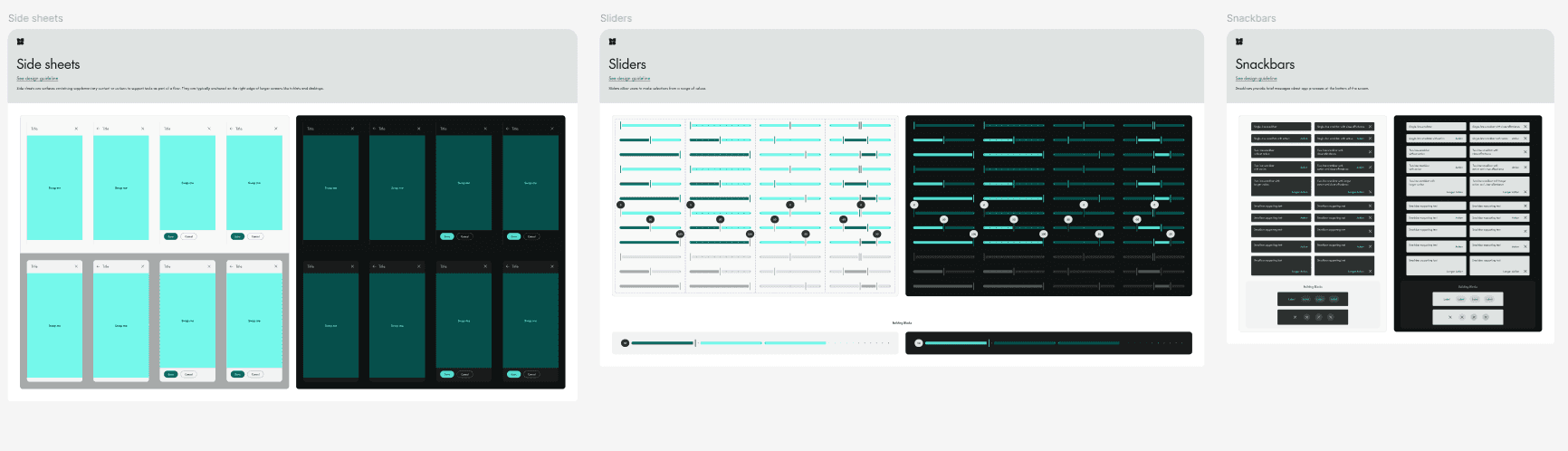

Some example of how the components set up looks like 👀


After that the design system version 1 introduced to the team…
There are massive changes from the team about foundations settings
The design system is under review by the team, since there are another round of changes of primitives tokens - decision maker decided to change the usage of primary colors and the design system is handed off to another designer to follow up.

See other case studies ↓